Nice to meet you!
Word nerds, code bunnies, font addicts and vector wranglers... we're here to help your business shine online.
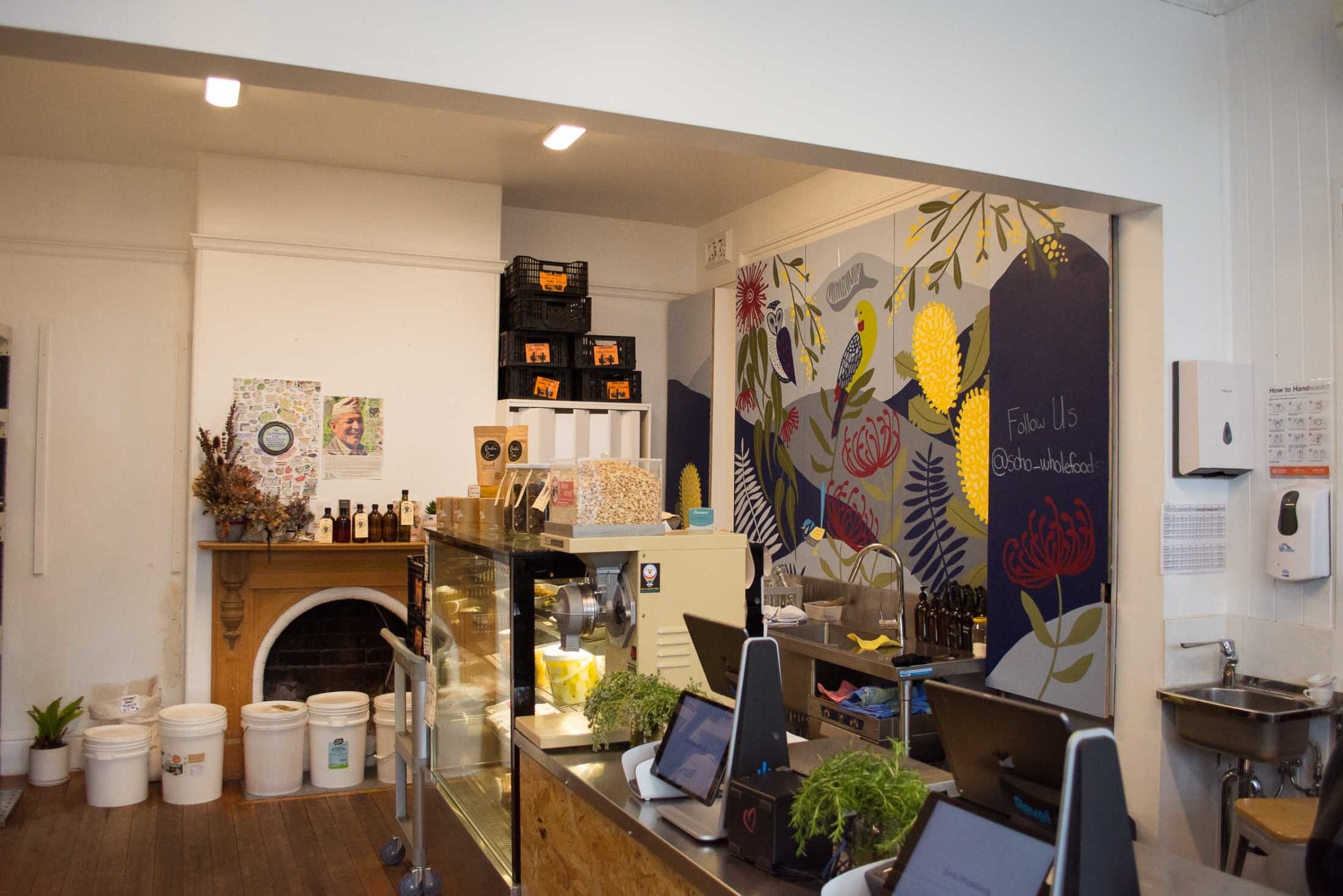
SoHo Wholefoods is a health food store located in South Hobart, Tasmania. A boutique health food store packed with a wide range of natural, organic, and locally sourced products Soho Wholefoods supports local business, promoting sustainability and being inclusive, helpful and fun within the community.
Angus Souter and Lisa Counsell bought Soho Wholefoods after moving to Tasmania for a tree-change after the birth of their first bub. The business had previous belonged to another wholefoods store which closed this South Hobart location to focus on its original location.
Soho Wholefoods needed its own identity which was fit for its historic location, and into a suburb where local shoppers, busy people and families who have solid values but maybe not the time and resources to be able to shop as 'perfectly' as they'd like to. They love being able to buy local and sustainable when they can but they aren't hardcore, nor do they label themselves. They're curious about how they can shop better with some of their household purchases to support a healthy lifestyle and environment.
Working with A Lined Design has been the most fantastic experience. Sarah and the team were able to decipher our pie in the sky ideals and create a brand and logo that perfectly matched the feel we were going for. So easy to work with and very timely, highly recommend!
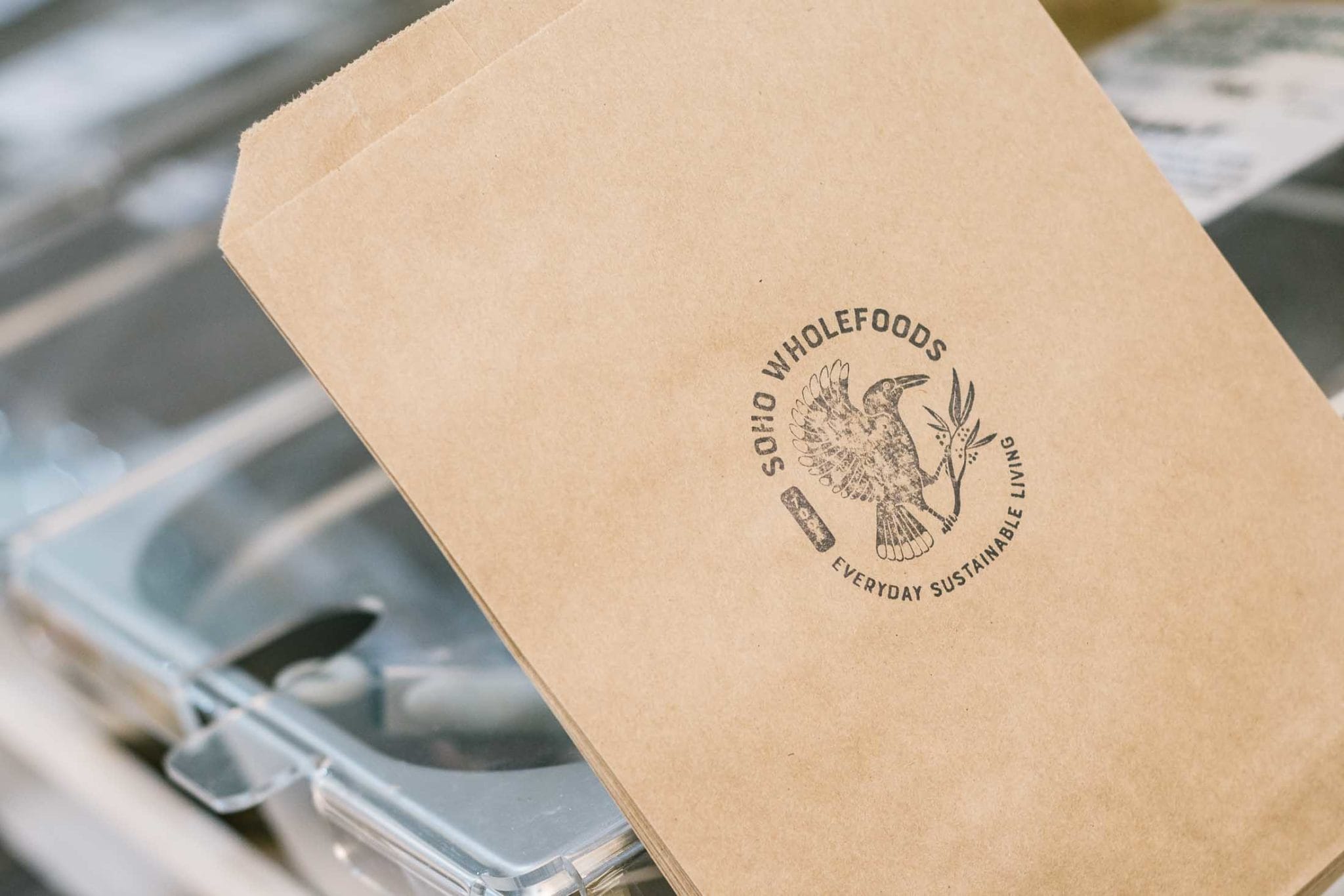
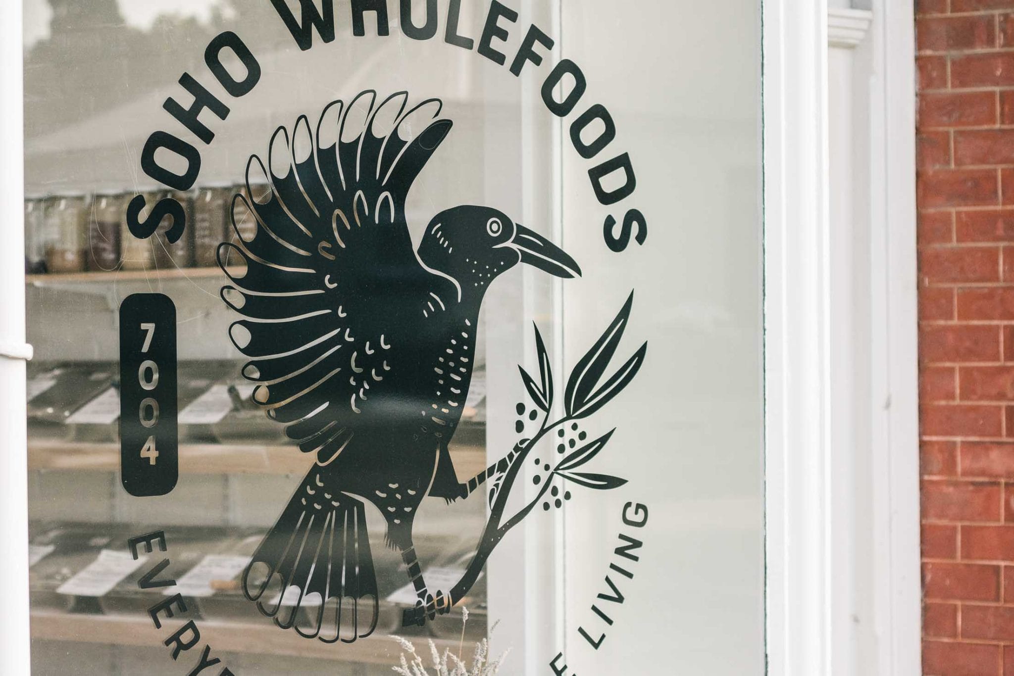
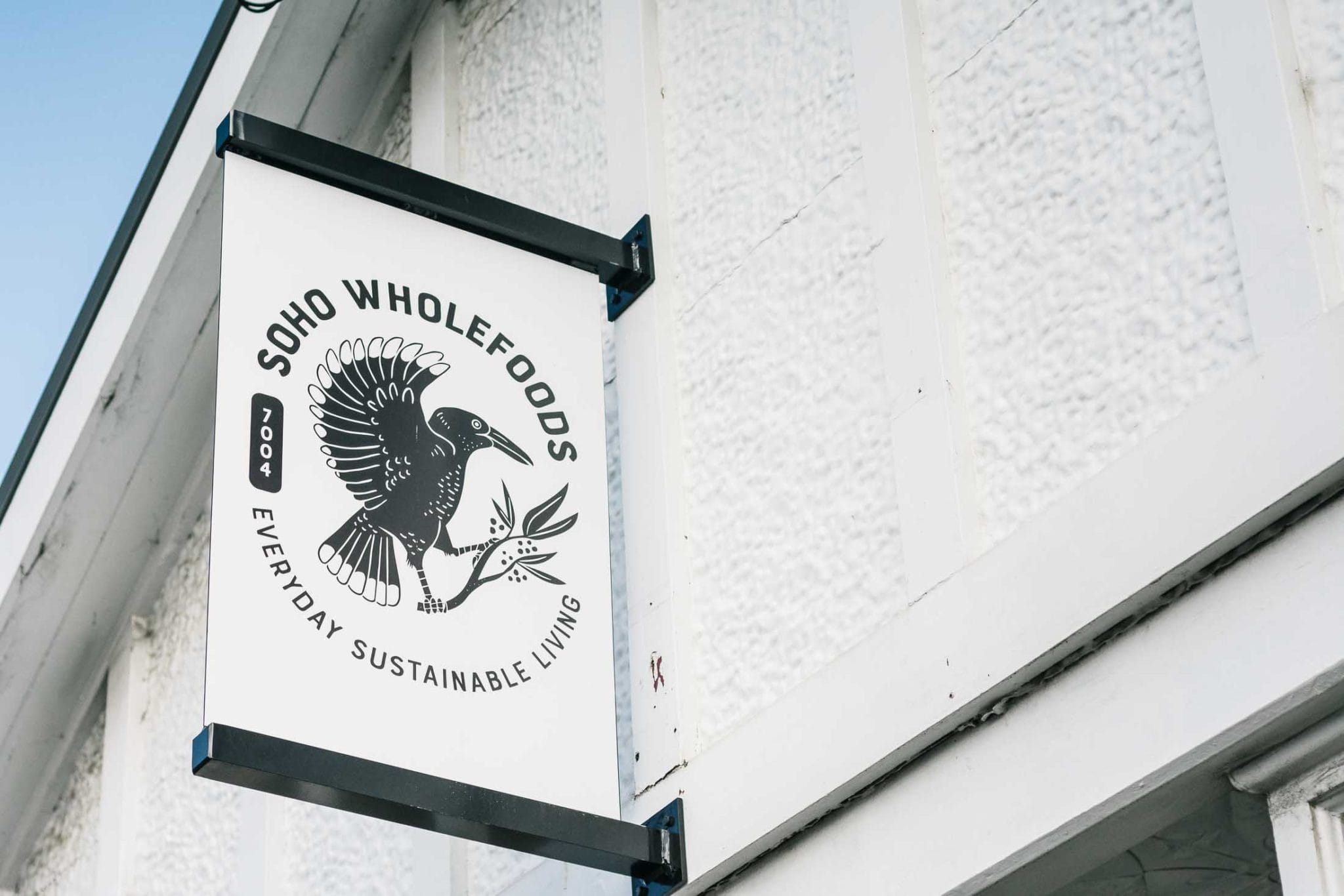
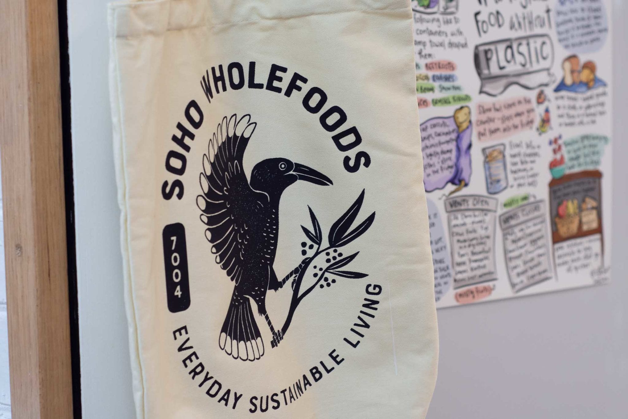
Looking to the historial brands of the location (Cascade is right down the road, the Keen's Curry sign can be seen from half a street over, and the original Bludstone tannery only a block away!), the wildlife which is so integral to this bushy suburb, and the values of wanting to create community we created a coat-of-arms of a Currawong - you can hear these fellows all around the store at any time of day! - perched on pepperberries.
Currawongs are curious by nature, always wanted to try something new. If you leave your lunch alone around them... it won't be your lunch anymore!
A punchy black and white linocut vibe is perfect for stamping on kraft bags used in store, and creates the simplicity the brand requires.
In today's digital age, having a strong online presence is crucial for businesses. That's why it's essential to work with a web development company that not only understands the technical aspects of building a website but also has a strong focus on creative design.
We specialize in creating custom websites that are not only functional but also visually stunning. Our team of experienced designers understands the importance of a website that truly reflects your brand and engages your target audience. From eye-catching graphics to intuitive navigation, we'll work with you to create a website that is tailored to your unique needs and helps you stand out from the competition.
So if you're looking for a web development company in Hobart, Tasmania, that prioritises creative design, look no further than our team of experts.