Hobart Women’s Shelter
50 years of providing safety, dignity, and a path forward.
The Hobart Women’s Shelter has supported women and children facing homelessness and family violence since 1974. As the second-oldest women’s shelter in Australia, its impact is deeply embedded in the fabric of the Tasmanian community.
In 2024, the organisation embarked on a milestone campaign—50 Homes for 50 Years—and needed a brand and website that could honour its legacy while carrying it powerfully into the future.
The Project Brief
The existing logo and website no longer reflected the strength or warmth of the organisation’s work. Our challenge was to:
Refresh the brand to resonate with both those seeking help and those wanting to support
Create a website that balances usability, safety, and accessibility for women in crisis
Support the Buy a Brick fundraising campaign with a bold visual presence and clear calls to action
Ensure privacy and dignity by avoiding photography and using inclusive, non-identifying illustrations
Honour the purple colour palette, symbolically tied to feminism and dignity
The Hobart Women’s Shelter team supplied their own copy for the website. Our job was to build a visual system that could carry those words with strength and compassion.
We delivered
BRAND DESIGN
Outstretched arms. A protective roof. Foundations that run deep.
We redesigned the logo to centre a core idea: safety as shelter.
The new symbol evokes a home formed by outstretched arms beneath a secure roof—offering protection, comfort, and community.
We retained the original purple, modernised into a more vibrant, high-contrast palette
The word “home” is subtly highlighted within the logo text, nodding to the previous design while increasing readability and resonance
A warm off-white background replaces stark white to soften the brand and add a gentle glow
For illustration, we developed a versatile stock vector style and extended palette that maintains anonymity while allowing storytelling across digital and print assets.
WEB DESIGN
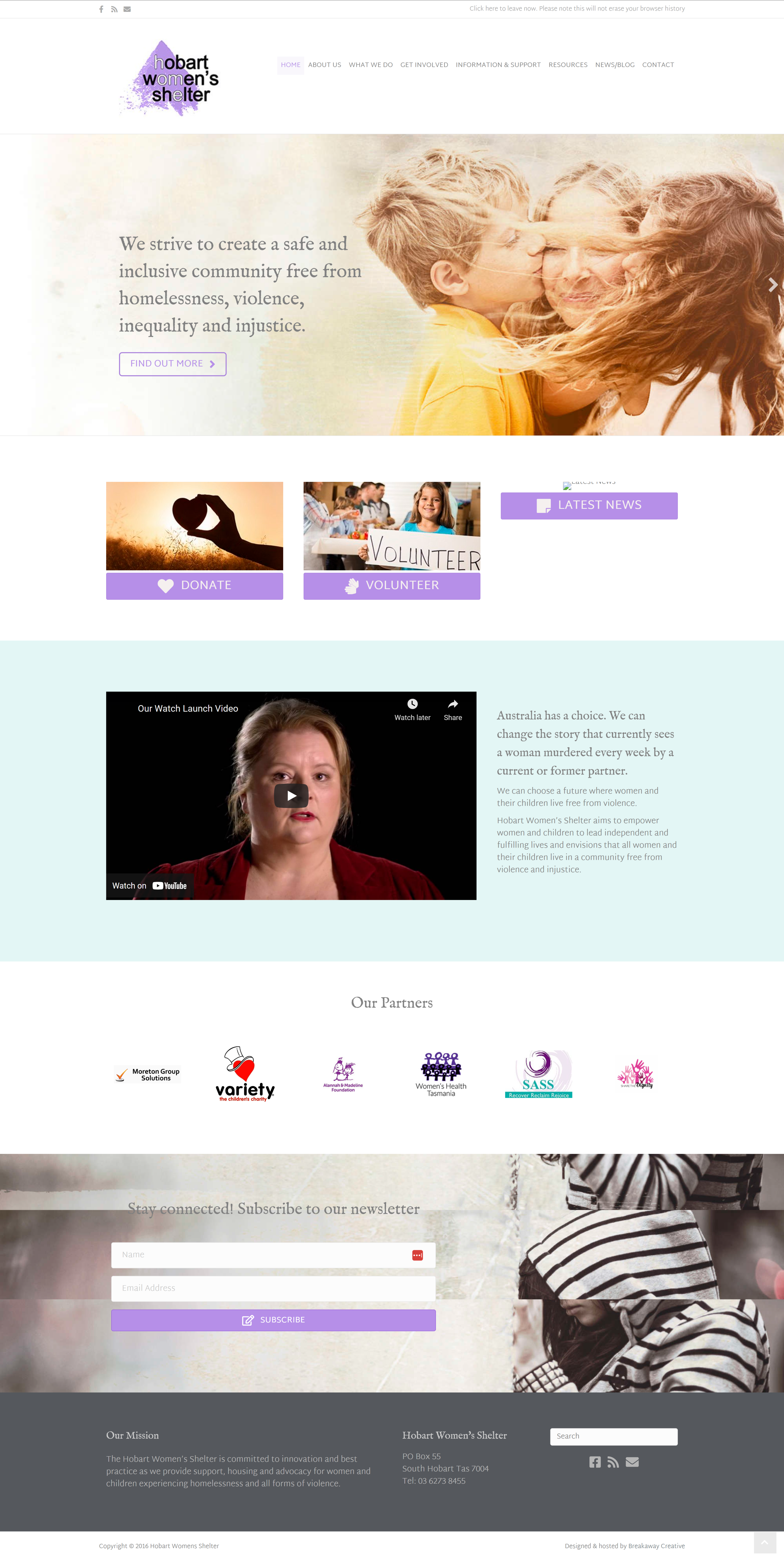
A calm, clear space with one purpose: support.
The website is designed with a trauma-informed approach—low sensory load, clear navigation, and soft colour blocks that feel safe and reassuring.
Key features include:
A bold but simple Quick Exit button for safety
Vector illustrations tailored to reflect diversity, safety, and connection without compromising privacy
Accessible layout and strong visual hierarchy to support fast navigation for users in crisis
Flexible sections that allow the team to highlight campaigns, services, and urgent calls to action
The new site supports both ends of the Shelter’s mission: offering immediate help to those in need and inspiring ongoing support from the community.