Cherish Skincare
Meet Edwina Cummings, founder of Cherish Skincare: a woman on a mission to simplify beauty and amplify purpose.
Cherish was born from a belief that every woman deserves to feel cherished, and that skincare should be clean, cruelty-free, and joyfully uncomplicated. Proudly Australian-made, the brand is all about effective formulas, kind ingredients, and ethical sourcing. But it’s also more than that.
Cherish proudly supports Be Hers, a charity working to end modern slavery and human trafficking. Every purchase is a step toward freedom and empowerment—for your skin and for women around the world.
The Project Brief
Edwina needed a brand that reflected her values and resonated with her ideal client:
Women in their mid-twenties who are conscious, curious, and care deeply about what goes on their skin
Clean-beauty lovers who are ingredient-aware, but also love a bit of fun and femininity
An extended audience of aspirational users—older and younger women who care about the planet, animals, and clean beauty principles
Visually, the brief was: Simple, organic, colourful. Feminine, but not flowery. High contrast, not harsh.
We delivered
BRAND DESIGN
Soft edges, strong heart.
We designed a brand that feels fresh, effortless, and emotionally resonant:
A palette of warm peach and soft pastels, grounded by confident black and crisp white
The butterfly icon—with heart-shaped wings—is delicate but full of intention, symbolising transformation, beauty, and care
The logotype and supporting fonts pair Gambero, a clean modern serif, with Think Pink, a playful sans with a vintage nod—like a modern update on an old apothecary label
The brand is flexible enough to span skincare packaging, social, ecommerce, and advocacy content
It’s skincare, but it’s also statement care—rooted in values and purpose.
WEB DESIGN
Big-hearted beauty with a bold design twist.
Cherish’s website is clean, joyful, and product-first. Designed to support eCommerce and storytelling in equal measure:
Hero peach tones pop beautifully against deep black accents, creating contrast without coldness
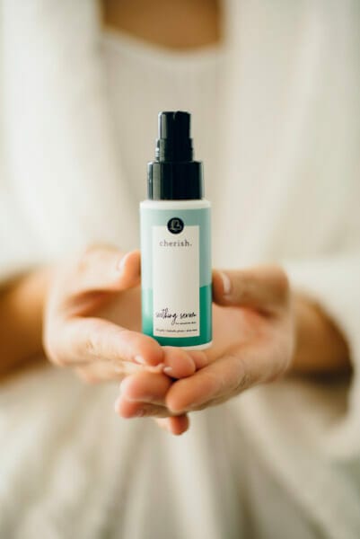
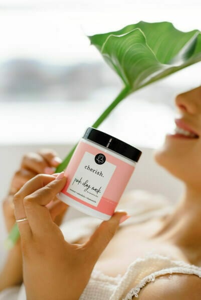
Each product is given its own gelato-inspired colour, adding personality while supporting navigation
Large-format photography features real women, soft styling, and happy light—building trust and approachability
Whitespace is used generously to give each product (and its purpose) room to breathe
And yes, we also adore the pink clay mask!
Cherish Skincare doesn’t just care for your skin—it reminds you that you matter. That you deserve simplicity, softness, and space to care for yourself while caring for others. The brand holds that message with grace and a good dose of glow.


Home Page

About Page
