Sofia Women’s Circle
Meet Giselle Perry: a woman of warmth, strength, and presence. After years of seeking a community that resonated with both her modern life and deeper feminine longing, Giselle created what she couldn’t find: Sofia Women’s Circle.
It’s a grounded space for modern women to reconnect with ancient feminine wisdom through the practice of Circles—gatherings that centre equality, deep listening, and authentic connection. Sofia isn’t about woo or performative healing. It’s about women holding space for each other, with grace and groundedness.
The Project Brief
Giselle came to us with a clear vision:
Anchor the brand around a painting by her aunt—earthy, personal, and symbolic
Create something warm, welcoming, and modern—not overly spiritual, but deeply soulful
Appeal to like-minded women navigating the corporate world and seeking deeper connection
Build a brand that felt feminine without being frilly, simple without being stark
The ideal tone? Soft power.
We delivered
BRAND DESIGN
Rooted, radiant, and full of quiet symbolism.
We built the brand from a palette of deep greens, warm browns, and gentle pinks, reflecting growth, stability, and feminine energy without cliché.
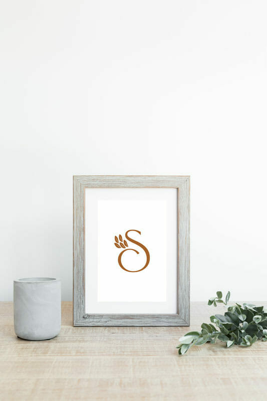
The logo is a minimal yet bold wordmark, paired with a symbolic tree graphic used in optional lockups
Typography combines Chatillon and Sophia Reign: elegant, slightly unexpected, and full of graceful detail
These fonts echo natural shapes—bark, leaves, flow—while retaining clarity and contrast
It’s a brand that feels handcrafted, modern, and gently powerful… just like Giselle’s circles.
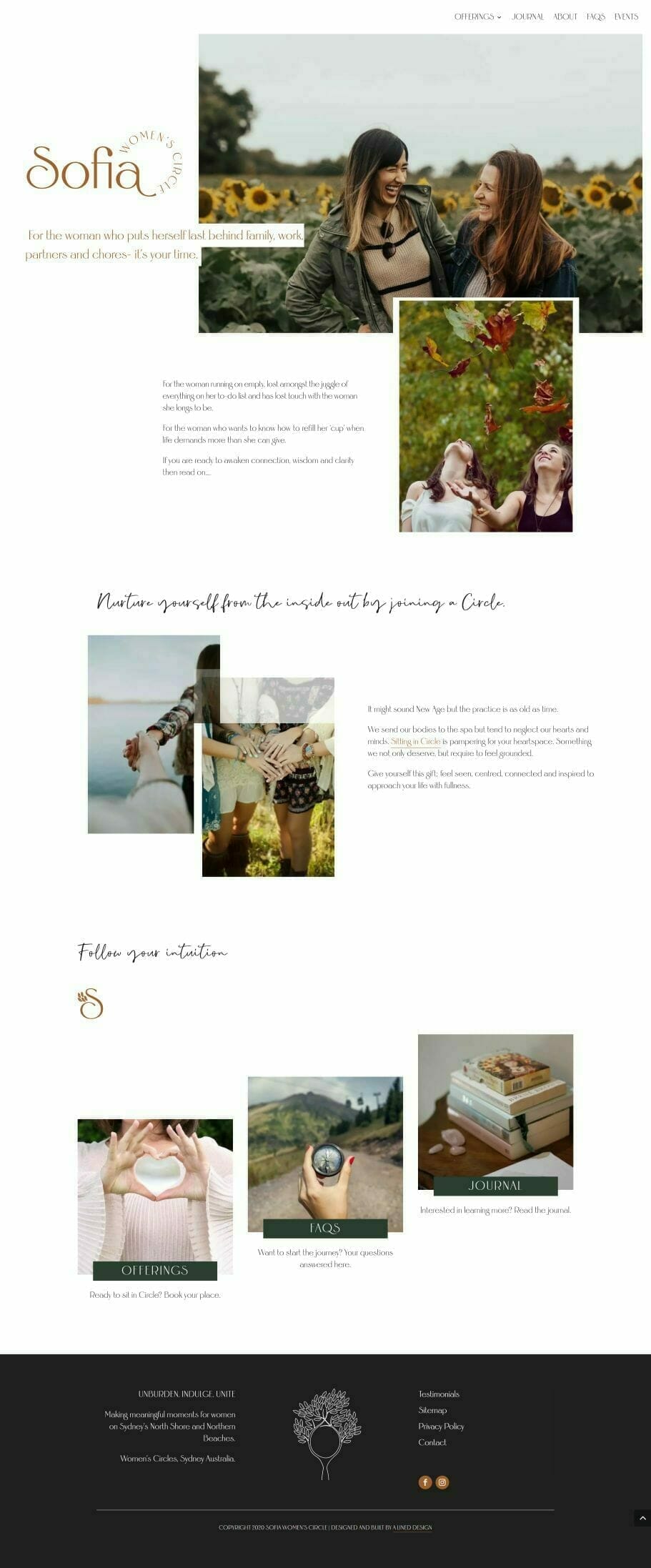
WEB DESIGN
Spacious, serene, and gently guiding.
The website is designed to feel like a beautiful invitation: calm, clear, and layered with intention.
Peachy-brown tones add softness and depth without feeling washed out
Cut-out sections for text create a sense of movement and depth—like looking through foliage
White space is used generously, but always balanced with warmth
Subtle animations bring gentle motion and a sense of quiet aliveness
The visual tone is feminine, but never shouty, supportive and grounding
Whether a visitor is looking to join a circle, gift an experience, or simply learn more, the site makes space for slow scrolling, curiosity, and contemplation.


Sarah came highly recommended and she didn’t disappoint. I was warned it was not a one way street, Sarah and Dawn really drilled down to uncover the essence of Sofia Women’s Circle which helped me gain greater clarification at the same time. Being technically challenged I was fearful the process would be way over my head, however, Sarah’s creativity, patience, communication and sense of humour saw the process unfold with military precision, like an iron fist in a velvet glove. No question was too trivial, no number of revisions was too many and I really valued her empathy during a time when things were very new to me. I am telling everyone I know what a fabulous experience it was to build a website alongside Sarah & Dawn and more importantly what joyous women they are.
So, gratitude is threefold:
1. For the original recommendation from Flossifiles
2. For the wonderful website and experience and
3. For our paths crossing and walking side by side for a while.